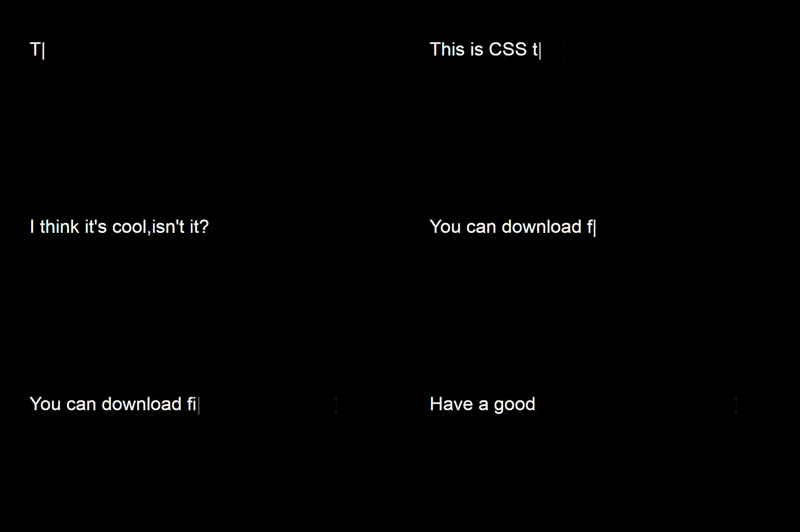
CSS Typing animation example
In this post, I’ll be sharing the code to create the CSS typing effect in web pages. You can integrate this code in your .NET pages, php pages, html also. Typing animation makes a web pages looks cooler. This effect which I’m mentioning here has the backspace effect also. So you can supply multiple sentences as well.
Make a file named index.html and two folders with name css and JS.
In your html page create a div with class=”startTyper”
<div class="startTyper"></div>
And write this script
<script>
$(function() {
$(".startTyper").typed({
strings: ["Hi, I'm Hitesh S Vikani, a software developer from Mumbai","This is CSS typing effect", "I think it's cool,isn't it?", "You can download files from github.com", "Have a good one!"],
typeSpeed: 50, // typing speed
backDelay: 100, // pause before backspacing
loop: true, // loop on or off (true or false)
loopCount: false, // number of loops, false = infinite
});
});
</script>
Full Html code :
<!DOCTYPE html>
<html class="no-js" lang="en">
<!--<![endif]-->
<head>
<title>CSS Typing effect! - ParallelCodes.com </title>
<link rel="stylesheet" type="text/css" href="css/style.css">

</head>
<body class="container" style="background-color:#000;font-family:Arial">
<div class="startTyper"></div>
<script type="text/javascript" src="js/jquery.min.js"></script>
<script type="text/javascript" src="js/compressed.js"></script>
<script>
$(function() {
$(".startTyper").typed({
strings: ["Hi, I'm Hitesh S Vikani, a software developer from Mumbai","This is CSS typing effect", "I think it's cool,isn't it?", "You can download files from github.com", "Have a good one!"],
typeSpeed: 50, // typing speed
backDelay: 100, // pause before backspacing
loop: true, // loop on or off (true or false)
loopCount: false, // number of loops, false = infinite
});
});
</script>
</body>
</html>
Make a new folder with name cs and create a CSS file with name style.css
Css code : cs/style.css
.container{
padding:100px;
color: #fff;
font-size: 45px;
margin: 0;
line-height:100%;
margin-top: 120px;
}
.startTyper{
color: #fff;
display: inline-block;
}
#typed-cursor{
opacity: 1;
font-weight: 100;
-webkit-animation: blink 0.7s infinite;
-moz-animation: blink 0.7s infinite;
-ms-animation: blink 0.7s infinite;
-o-animation: blink 0.7s infinite;
animation: blink 0.7s infinite;
}
@-keyframes blink{
0% { opacity:1; }
50% { opacity:0; }
100% { opacity:1; }
}
@-webkit-keyframes blink{
0% { opacity:1; }
50% { opacity:0; }
100% { opacity:1; }
}
@-moz-keyframes blink{
0% { opacity:1; }
50% { opacity:0; }
100% { opacity:1; }
}
@-ms-keyframes blink{
0% { opacity:1; }
50% { opacity:0; }
100% { opacity:1; }
}
@-o-keyframes blink{
0% { opacity:1; }
50% { opacity:0; }
100% { opacity:1; }
}
You will need two Javascript to make the effect work.
Download the Javascript files from here and add in the folder named js

Github Link
If you like this post, like my Facebook page and share it your friends.